Clarity or uncertainty? In her visualizations, NSF CAREER awardee Lace Padilla balances both
Tue 08.01.23 / Matty Wasserman
Clarity or uncertainty? In her visualizations, NSF CAREER awardee Lace Padilla balances both
Tue 08.01.23 / Matty Wasserman
Clarity or uncertainty? In her visualizations, NSF CAREER awardee Lace Padilla balances both
Tue 08.01.23 / Matty Wasserman
Clarity or uncertainty? In her visualizations, NSF CAREER awardee Lace Padilla balances both
Tue 08.01.23 / Matty Wasserman
While Lace Padilla’s data visualization forecasts are intended to appear simple, the research and psychology behind their designs are anything but.
Through a rigorous, methodical process, Padilla boils down sophisticated scientific concepts and projections into easily interpretable diagrams and graphics, helping the public understand the extent of natural disasters and health crises before or as they emerge.
Her greatest challenge is accurately portraying natural events that are inherently unpredictable — such as hurricanes, wildfires, or epidemics — to an audience that seeks immediate, definitive answers. People, especially those without scientific backgrounds, generally struggle with the concept of uncertainty in predictive measurements, even though most scientific models consist of far more “gray area” and changing variables than clear-cut answers.
For her research examining this struggle to comprehend uncertainty in forecast visualizations, as well as how to better represent uncertainty in future models, Padilla won the prestigious CAREER Award from the National Science Foundation (NSF) in June. The award recognizes early-career faculty for their innovative research and commitment to equity in STEM, as well as their potential to make an impact in academia. And as she joins Northeastern this fall with a joint appointment between Khoury College and the College of Science, Padilla plans to further her data visualization research and teach courses on the Oakland and Boston campuses.
“People have a very hard time understanding the uncertainty of projections. It is one of the hardest concepts for the average person to grasp,” Padilla said. “Luckily, visualizations can make it easier for people if they are done well. Or they can cause serious misunderstandings, so it’s a double-edged sword. You have to be very careful when designing them.”
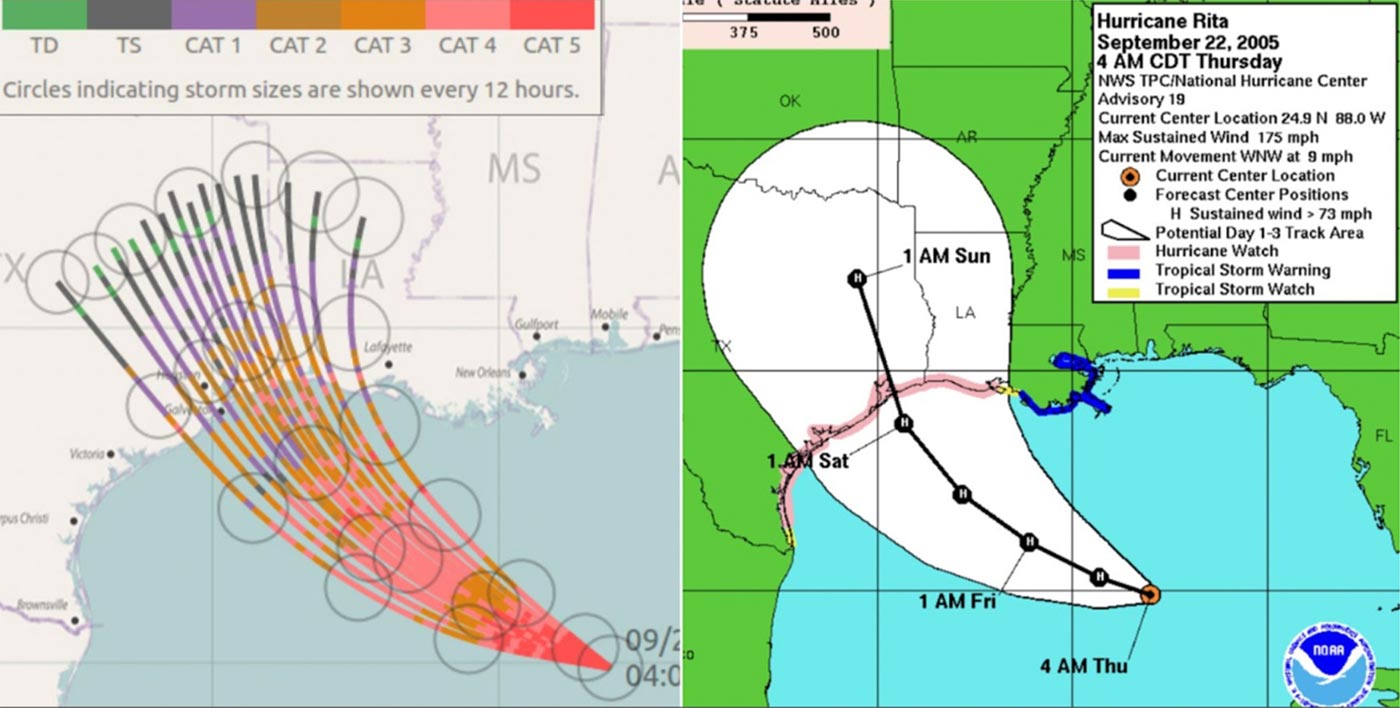
One example Padilla cites is the “cone of uncertainty,” which models the potential impact of an oncoming hurricane for different geographic areas. Often, these visualizations can be too simplistic and misleading, and cause people to not evacuate or properly prepare for impact due to a false sense of security.
“People think ‘I’m in the danger zone, I should evacuate,’ and if they’re just outside the edge of the cone, they are safe. But of course, there is no boundary to a hurricane path. The hurricane doesn’t care where we’ve marked it,” Padilla said. “So we had to come up with better techniques to convey this distribution and the gradient of risk. And what we find is that most effective visualizations show a range or distribution of outcomes rather than a binary answer.”
And while projection visualizations must prioritize accuracy and reflect nuance, the work is irrelevant unless it’s digestible within seconds. The blending of those seemingly paradoxical concepts is where Padilla’s diverse educational background becomes crucial. Her artistic expertise comes from her bachelor’s and master’s degrees in design, her behavioral expertise from a PhD in cognitive neuroscience, and her scientific expertise from her role as a NSF STEM Ambassador and other research initiatives.
“Data visualization is the perfect way for me to use these intuitions that I developed in art and the basic science I learned about how the mind processes visual information. Then I use that to create visualizations that can help improve the health and safety of people around the world,” Padilla said.
Another critical trait is Padilla’s ability not to be married to her own ways of processing information. When designing a graphic, she weighs the interpretations that people may make based on their own perspectives. In the hurricane example, Padilla must weigh how those in the line of the storm will interpret her model, while also considering if those living 30 miles inland will be accurately informed.
“Through making and critiquing art over a lifetime, you develop an intuition for what the ‘normal’ person is going to think,” Padilla said. “Oftentimes, someone who’s making a visualization with all this excellent math underpinning it will say ‘Well, people should interpret it this way.’ But I don’t make a lot of assumptions about what people should do or how they should think.”
Likewise, it’s critical to assess accessibility not only geographically, but also demographically. In many cases, Padilla tailors her work to those who she feels most need the concept of uncertainty reinforced through visuals.
“The people who are most affected by uncertainties — specifically by climate change, COVID, and hurricanes — are those who are in underrepresented populations,” Padilla said. “Those groups tend to have lower levels of education and lower socioeconomic status, so I try to make visualizations for them and I assume nothing about what they know.”
The process of getting visualizations finalized and widely adopted is often slow, particularly when working with government agencies that are hesitant to make sweeping changes. But still, Padilla has made progress. For instance, she has researched wildfire visualizations alongside one of the county’s premier wildfire experts, and while the work is still in progress, she expects their final product to be adopted officially in California. And despite the grueling development process, she hopes to continue her campaign to make the general public more comfortable processing uncertainty in this new phase of her career.
“One aspect of my CAREER award is training young people to understand uncertainty in visualizations,” Padilla said. “Especially with climate change, uncertainty will become increasingly more important, and we need to make people more resilient to these uncertainties. It’s only going to impact more of our decisions in this changing world.”